Skip to content
Sharif Amlani, PhD

Data Visualization

Here are some of my favorite plots made using ggplot2 from various research projects

Bar chart of polarization in vaccine discussion networks
Difference-in-differences estimates of the vote-by-mail effect on turnout
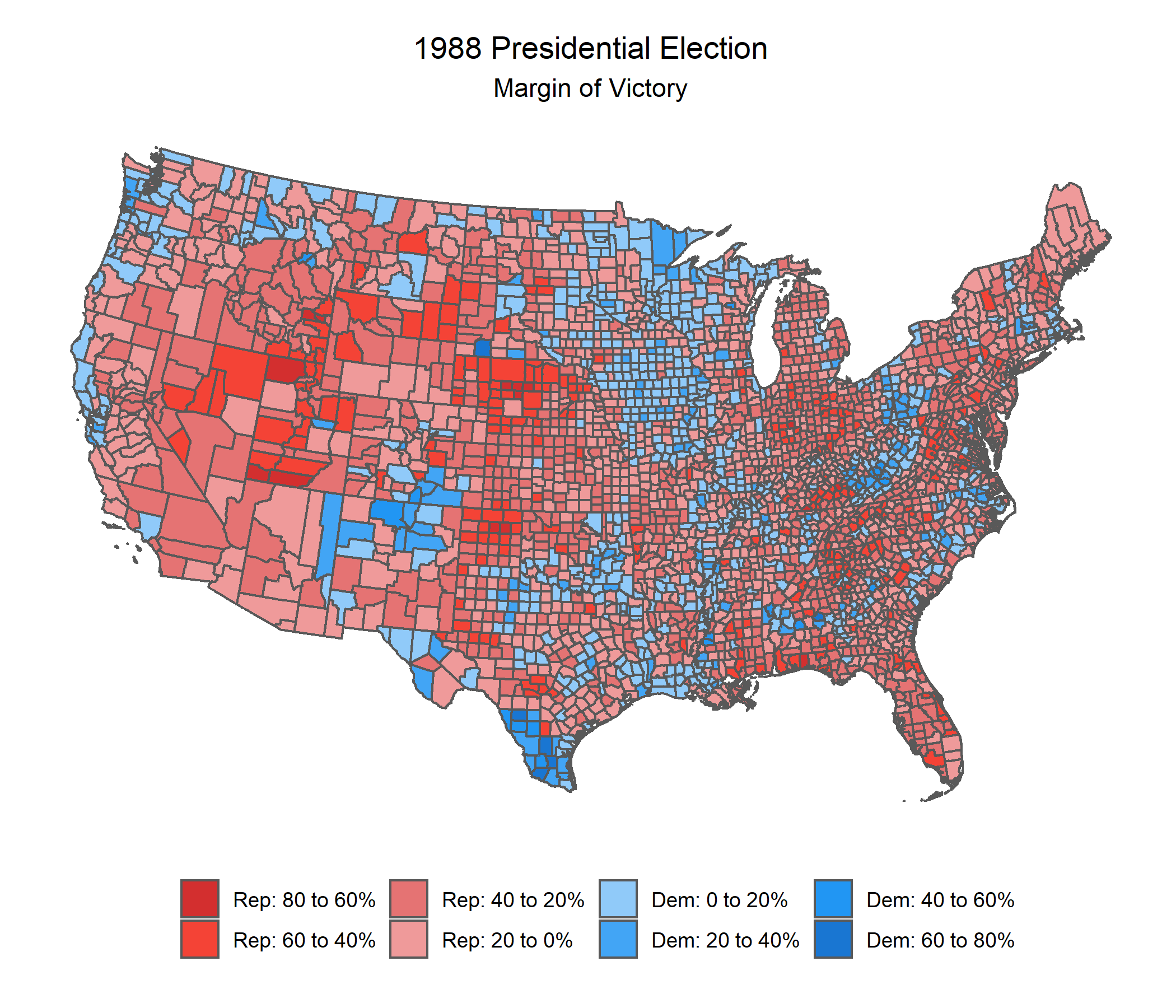
Map of county-level margin of victory in the 1988 presidential election
Map of the donor constituency for Representative John Garamendi
Donor ideology over time for Democrats and Republicans
Map of the geographic origins of campaign contributions
Plot of congressional responsiveness to donors
Frequency of emotion words by partisan group
Weighted distribution of support for California Proposition 53
Weighted distribution of support for California Proposition 64
Slope of S&P 500 stock prices since January 2019